
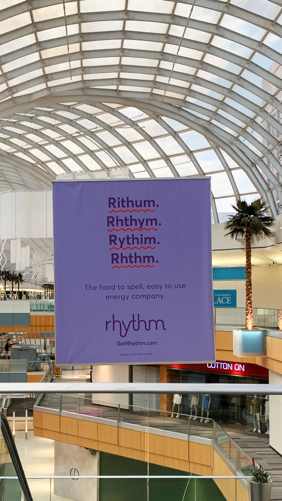
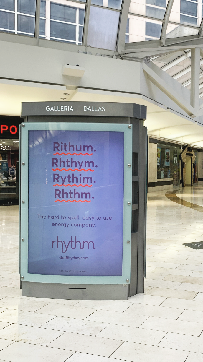
The hard to spell, easy to use
energy company.
Our brand purpose was to make energy easier for the love of people and the planet.
A brand new energy company
Rhythm was a pre-launch start-up when I joined in October of 2020 at the height of covid. They had a lackluster brand book without a visual system. I had 3 months to help bring to life a go-to-market campaign, design the launch website, create all collateral needed for a new energy company, and hire a team. Easy right?
Make it stand out.
In a crowded market of Energy providers in Texas, we chose purple as our brand color to stand out. After a few interviews with customers in the market and testing our new website, it became very apparent that purple was a huge difference from the other brands in the market in a good way. We leaned into that.


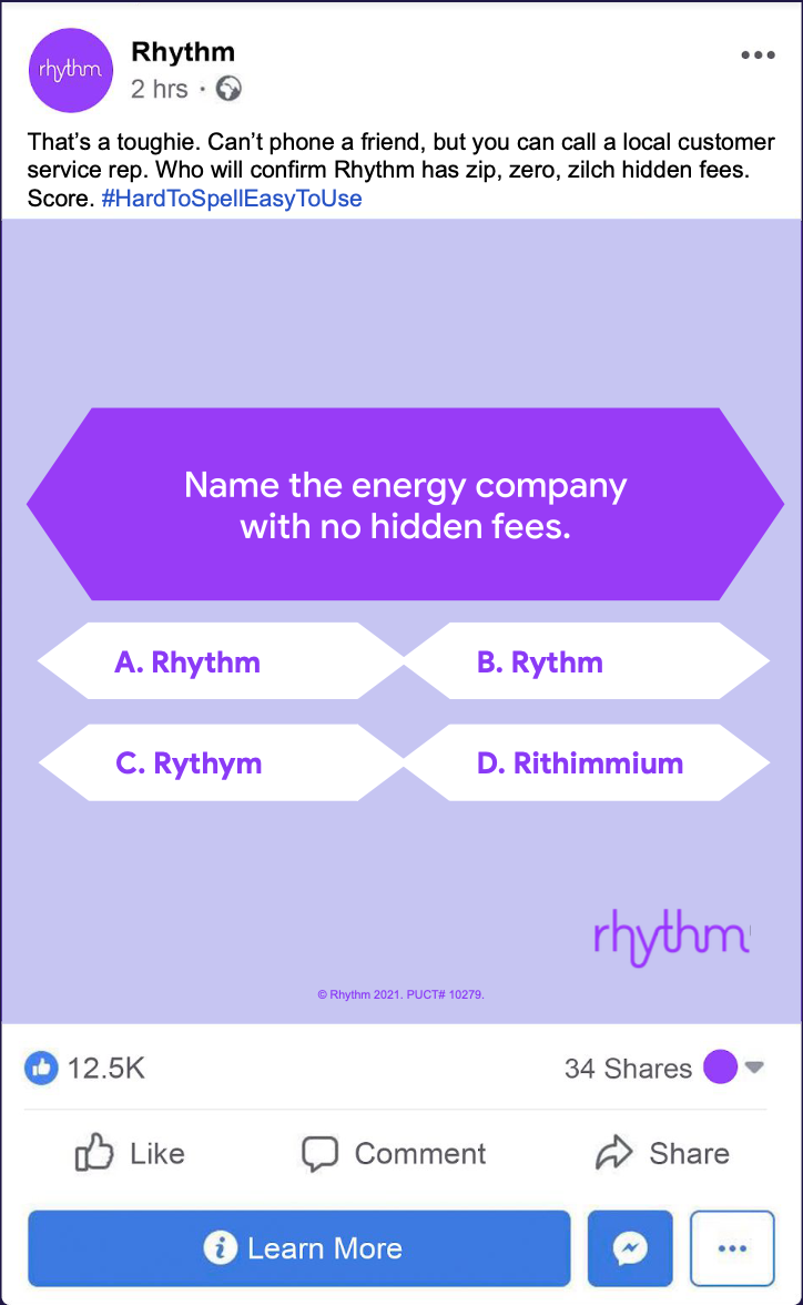
rhythium?
Our campaign needed to stand out in a mix of competitors in Texas. We created Rhythm with an emphasis on easy and leaning into humor. The campaign needed to be a mix of branding since we were brand new, and performance since we needed subscribers since we were starting from scratch.
Landing page tests
We tested 4 landing pages for the campaign, and the most simplistic one did the best. As we grew we continued to iterate on our website, the customer portal, and our ads. Everything we learned we put into new ideas for creative and campaigns.
Team:
Associate Creative Director: Maureen Cooley
Creative Agency: Mojo Supermarket
TV Spot Directors: Director Brothers
Senior Designer: Melissa Saylors